Process
Early Ideation
I initiated my design process with a virtual kickoff meeting, bringing together divisional stakeholders, subject matter experts, and the communications team. This collaborative session allowed me to collect essential requirements, brand imagery, and communications content.
With clear soft and hard deadlines set, I transitioned into the ideation phase, sketching and letting my creativity take the lead.
CHALLENGE 01
Establish a distinct and coherent user journey.
Unclear user experience leads to frustration in users—in turn increases the drop off rate.
EXAMPLE
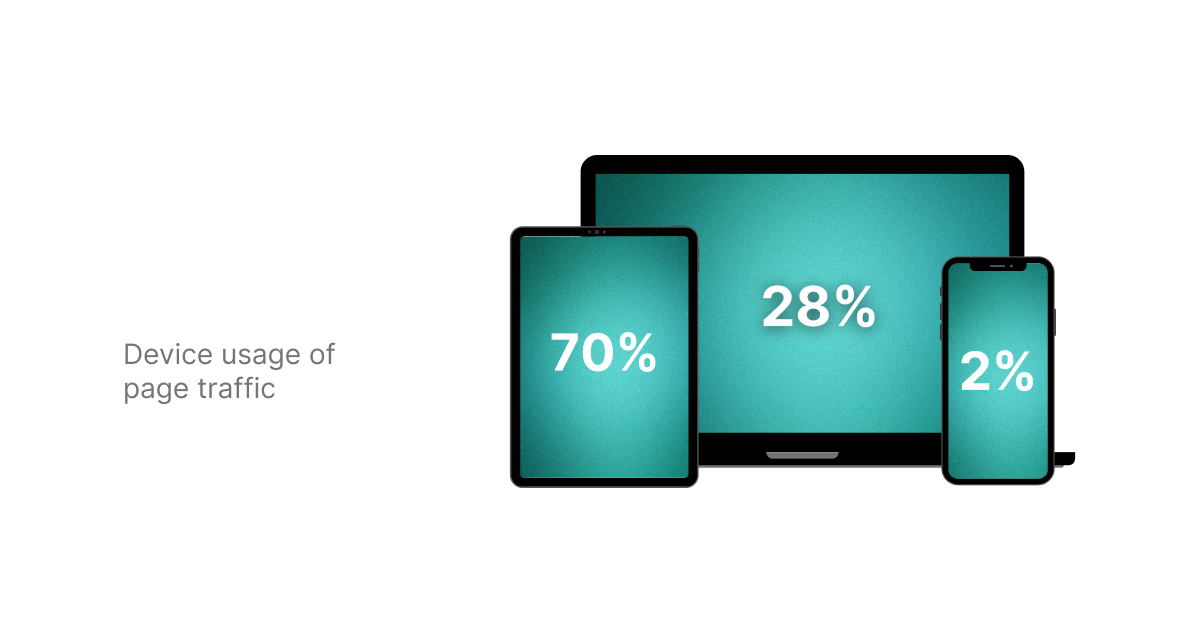
There are multiple ways for a user to land on the NOW TV page. I captured five primary user flows for a user to land on the NOW TV page.
IMPACT
With no defined journey, users easily get lost and lead to low conversion.
01
What would the ideal user journey look like for individuals?
02
How can we improve content relevancy to better match user expectations?
03
How can we align designs with brand guidelines effectively?
04
How can we seamlessly integrate permissioned links?
Sketching
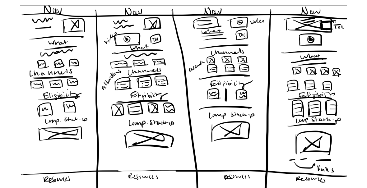
I employed the "Crazy Eights" design sprint technique to rapidly generate a myriad of wireframes. This method involves sketching eight distinct ideas in eight minutes, promoting creativity and out-of-the-box thinking. It's handy because your'e able to think up many ideas quickly, making sure we check out all options before picking the best ones.
CHALLENGE 02
No Relevancy
A pressing issue on the mySource platform is the lack of content relevancy. This means the content doesn’t always match what users are hoping to see which is vital to align with user expectations and drive desired results
EXAMPLE
When a user arrives on a product page and encounters irrelevant content, they may feel confused or believe they've landed on the wrong page.
IMPACT
This can quickly lead to frustration, prompting the user to leave the page immediately, resulting in a bounce.
01
What would the ideal user journey look like for individuals?
02
How can we improve content relevancy to better match user expectations?
03
How can we align designs with brand guidelines effectively?
04
How can we seamlessly integrate permissioned links?
Wireframe
To solve for content relevancy I chose one of the wireframes from the "Crazy Eights" design sprint that solved for strategically arranging the content provided by the sales communications team. The wireframe I chose ensured users can quickly skim and access crucial information without sifting through less relevant content.
First round of feedback
After presenting the wireframe to stakeholders, there was unanimous agreement that the design effectively addressed both user requirements and our business objectives. With no additional modifications suggested, I proceeded to develop the mockup.
CHALLENGE 03
Brand & Product Perception
Adherence to brand guidelines is paramount on platforms like mySource, especially when dealing with distinct brand imagery of NOW TV.
EXAMPLE
A user landing on the NOW TV page will expect to see the unique brand imagery and language that will also be reflected not only on mySource but through all marketing initiatives.
IMPACT
Deviation from brand guidelines risks legal complications and erodes user trust, resulting in a diminished experience with the brand.
01
What would the ideal user journey look like for individuals?
02
How can we improve content relevancy to better match user expectations?
03
How can we align designs with brand guidelines effectively?
04
How can we seamlessly integrate permissioned links?
Mockup
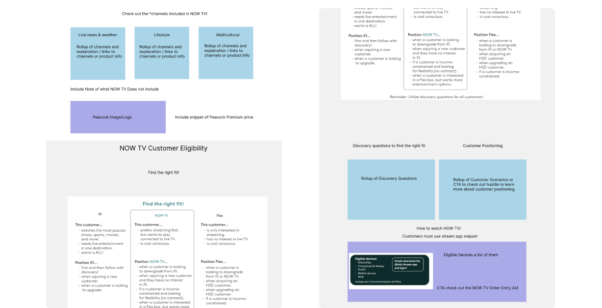
I started transitioning my wireframe to a mockup in Figma by including brand imagery. This gave it a more complete, branded look, turning the skeletal design into a visual representation closely aligned with our brand's identity.
CHALLENGE 04
Design Adaptation
I needed to integrate a link that directs users to the "What to Watch Tool". However, each link was designed to lead to division-specific pages.
EXAMPLE
For instance, while all divisions could access the main page, only the Northeast division could actually click and access the link for the Northeast "What to Watch Tool", and the same principle applies to the other divisions.
IMPACT
If the link descriptions aren't clear in the UX writing, users might mistakenly click the wrong "What to Watch Tool" link, resulting in a 304 error page. This confusion can lead to user frustration and potentially higher drop-off rates.
UX writing
To address the issue of division-specific permissioned links, I distinctly labeled them by adding a call-out that invites users to visit the "What to Watch Tool" to explore the latest and best shows available on NOW TV. Directly below, I titled each of the three links with the respective "division" followed by "What to Watch Tool". I also underlined these links to emphasize their clickability.
Second round of feedback
I shared the finalized mockup to our stakeholders, and it was met with approval, signifying a cohesive alignment with our project's objectives and brand standards.
Development
I built the responsive NOW TV page in mySource an Unily platform. The page was published August 18th, 2023.
.png)
.png)


.png)
.png)
.png)