Process
Early Ideation
I initiated my design process with a virtual kickoff meeting, bringing together divisional stakeholders, subject matter experts, and the communications team. This collaborative session allowed me to collect essential requirements, brand imagery, and communications content.
With clear soft and hard deadlines set, I transitioned into the ideation phase, sketching and letting my creativity take the lead.
CHALLENGE 01
Establish a distinct and coherent user journey.
Unclear user experience leads to frustration in users—in turn increases the drop off rate.
EXAMPLE
There are multiple ways for a user to land on the Xfinity Storm-Ready WiFi page. I captured four primary user flows for a user to land on the Storm-Ready WiFi page
IMPACT
With no defined journey, users easily get lost and lead to low conversion.
01
What would the ideal user journey look like for individuals?
02
How can we improve content relevancy to better match user expectations?
03
How can we align designs with brand guidelines effectively?
04
How can we seamlessly integrate new legally-approved content into our design?
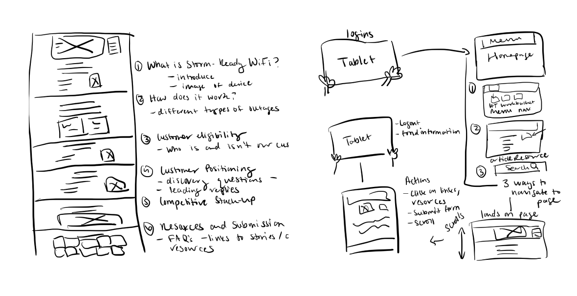
Sketching
I sketched multiple user journeys to map the steps users would take in seeking information about the Xfinity-Storm Ready WiFi product.
CHALLENGE 02
No Relevancy
A pressing issue on the mySource platform is the lack of content relevancy. This means the content doesn’t always match what users are hoping to see which is vital to align with user expectations and drive desired results
EXAMPLE
When a user arrives on a product page and encounters irrelevant content, they may feel confused or believe they've landed on the wrong page.
IMPACT
This can quickly lead to frustration, prompting the user to leave the page immediately, resulting in a bounce.
01
What would the ideal user journey look like for individuals?
02
How can we improve content relevancy to better match user expectations?
03
How can we align designs with brand guidelines effectively?
04
How can we seamlessly integrate new legally-approved content into our design?
Wireframe
To solve for content relevancy I included only content provided by the sales communications team and strategically arranged it by the most important information to secondary information.
First round of feedback
I shared the wireframe with stakeholders. Everyone agreed that the flows and content were thoughtfully crafted to cater to both our users' needs and our business goals. With no further edits I began crafting the mockup.
CHALLENGE 03
Brand & Product Perception
Adherence to brand guidelines is paramount on platforms like mySource, especially when dealing with distinct brand imagery of Xfinity Storm-Ready WiFi.
EXAMPLE
A user landing on the Xfinity Storm-Ready WiFi page will expect to see the unique brand imagery and language that will also be reflected not only on mySource but through all marketing initiatives.
IMPACT
Deviation from brand guidelines risks legal complications and erodes user trust, resulting in a diminished experience with the brand.
01
What would the ideal user journey look like for individuals?
02
How can we improve content relevancy to better match user expectations?
03
How can we align designs with brand guidelines effectively?
04
How can we seamlessly integrate new legally-approved content into our design?
Mockup
I started transitioning my wireframe to a mockup in Figma by including brand imagery. This gave it a more complete, branded look, turning the skeletal design into a visual representation closely aligned with our brand's identity.
CHALLENGE 04
Design Adaptation
I had to adapt my design process to quickly include new legal-approved content and infographics into my mockup, all while navigating tight deadlines and stakeholder feedback.
EXAMPLE
The additional content provides users with information that will deepen their product knowledge in turn helping them sell the product to prospective customers.
IMPACT
A user will benefit from the content additions by ensuring that they receive up-to-date, diverse, and comprehensive information that caters to their and customers evolving needs and preferences.
Second round of feedback
In the second feedback phase, stakeholders introduced new legally-approved content and shared static imagery for the page. I was tasked with seamlessly integrating this content and imagery into the design without disrupting the existing layout, while also ensuring accessibility.
Redesign
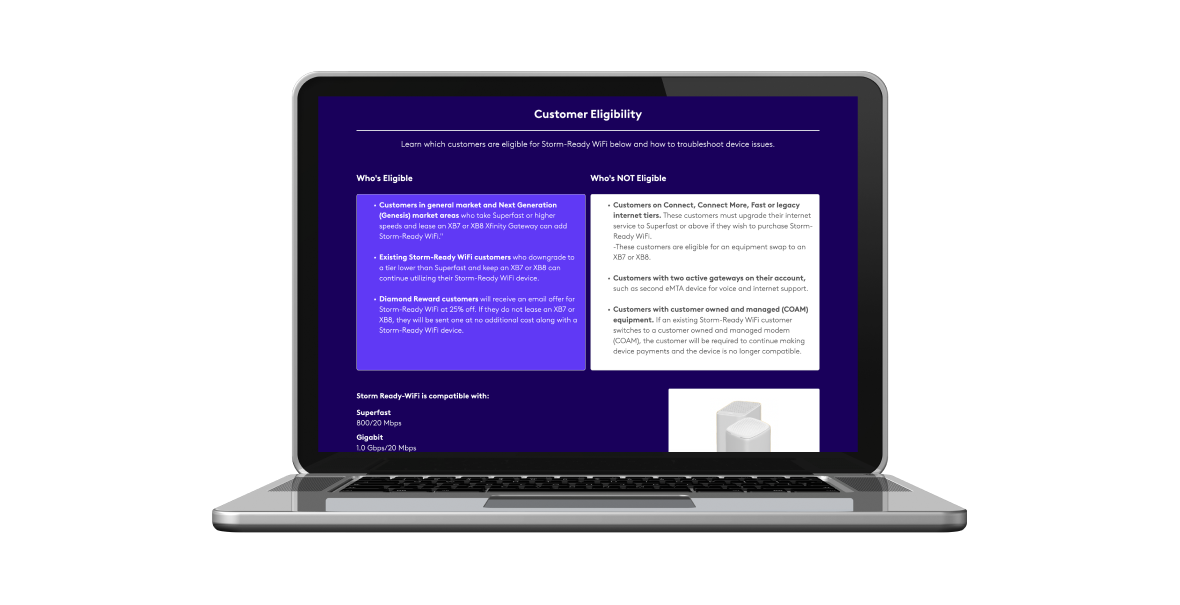
Stakeholders shared the importance of users not only being informed about customers who are eligible but also customers who are not eligible. The design changes included adding bold or larger font sizes for headings like "Eligible Customers" and "Non-Eligible Customers" which can provide immediate clarity for users. I divided the content by utilizing boxes and different colors to segment the information visually.
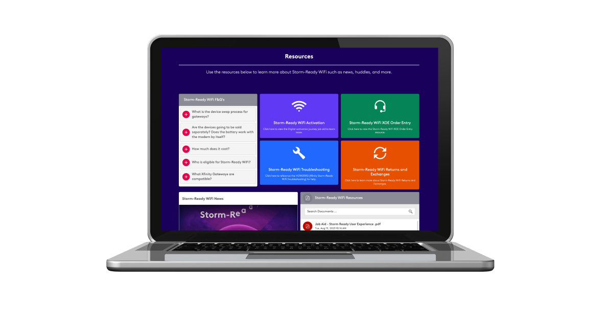
Content Strategy
Through discussion with the stakeholders the information was supplemental information that would best fit at the bottom of the page in the resource section. Focusing on the UI design I integrated buttons that link directly to these evergreen resources, ensuring they remain easily accessible and aren't obscured within other components. Now users can find these resources in multiple places on the page.
Accessibility
"Accessibility is not about designing for a few. It is designing for us all."
-Paul Boag | Share
I received static infographics from stakeholders and transformed them into accessible rich text designs for screen reader compatibility.
Third round of feedback
I shared the finalized mockup to our stakeholders, and it was met with approval, signifying a cohesive alignment with our project's objectives and brand standards.
Development
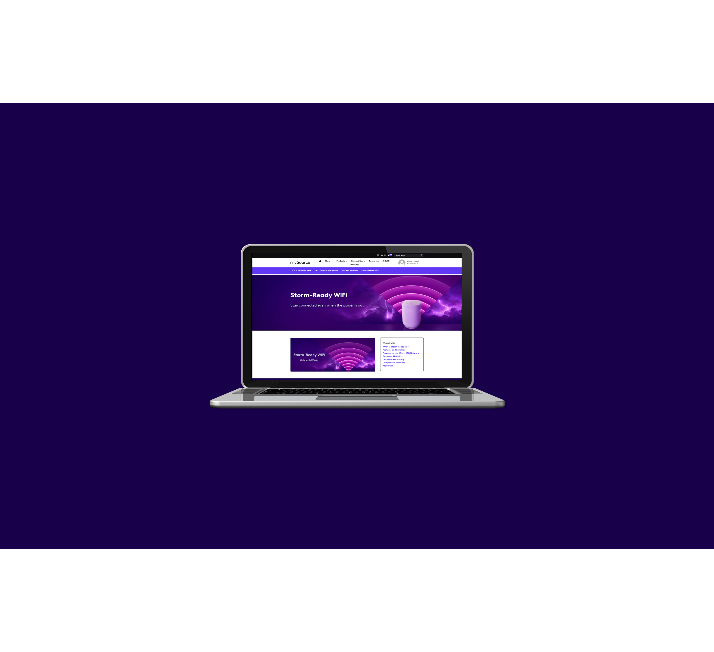
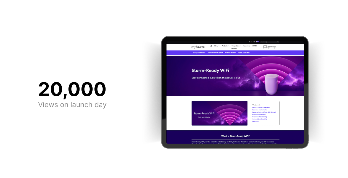
I built the responsive Storm-Ready WiFi page in mySource an Unily platform. The page was published August 18th, 2023.
.png)
.png)
.png)
.png)
.png)